
Can You See It? Can You Feel It? ?
Building color palettes that feel nostalgic
Published April 21st
Author Sade Nagel
So, we’ve researched and collected references of what aspects of a 1950s-1990s would saturate our kitchen: we’ve filled our world with sixties countertops, Sears appliances, and a Kit-Cat Klock, but there’s just one problem: the world is still cold and grey. In theory, the player is surrounded by an environment that looks warm and feels nostalgic and lived-in, but how do we as game artists go about conveying and evoking this sentimentality in a game where you play as a screw?
We do this through color and textures that feel intentional.
Before we started creating any art for the game, we were tasked with collecting inspiration and references for what we were imagining the game would look like. While searching for my images, I came across a project on Artstation by Phil Stoltz, a senior artist at PUBG:
We chose to loosely base our kitchen level on this kitchen environment project for several reasons:
The retro feel
The asset variety
The colors

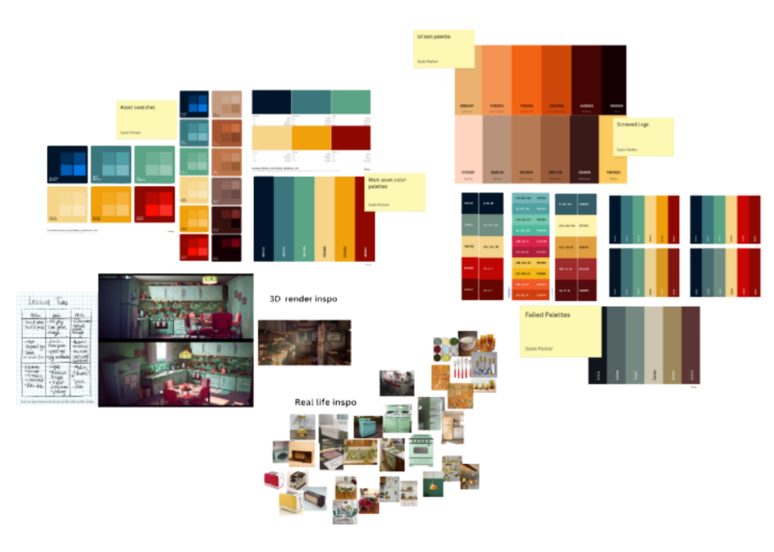
The following weeks were spent gathering real-life references and images from antique stores and old Sears catalogues and narrowing down our findings until we had a well-curated moodboard that represented the fusion of decades we wanted. After the art team reviewed the extensive moodboarding and research, I carried out my own research on color palettes.
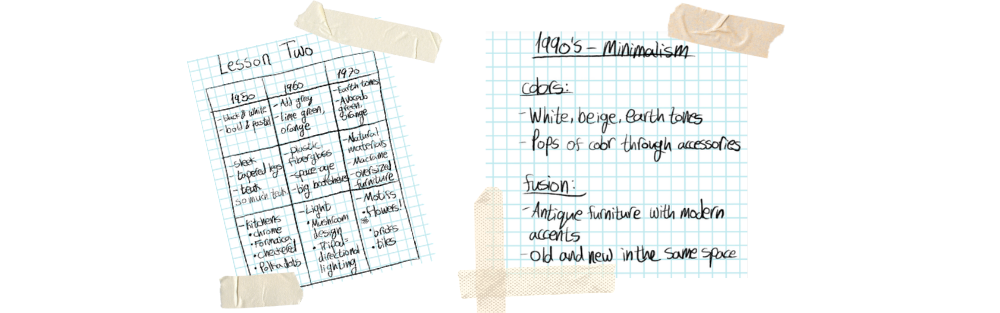
During my research, I came across a few articles by the team at Redecor; Redecor is a home decor and interior design game released in 2020 by Reworks Ltd. The articles shared details on the aspects of interior design from each decade of the twentieth century, from color to common countertop materials and patterns. I used what I learned in the articles to create my own mood board, specifically for color palettes and ideating surface materials.
Creating Our COlor Story
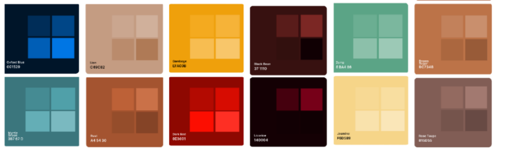
I tested, mismatched, and swapped several colors from palettes based on commonly used colors in the 1950s-1960s; however, our game takes place in the 1990s, so I opted for a fusion of colors and aspects from each decade. For example, while I enjoyed the pastel colors from the fifties, I found that a more saturated palette would be best for interactivity. Cooler colors would primarily be used on our large kitchen appliances and cabinetry, and warmer colors would be used for most interactable objects on the counters. While building color palettes, I also considered those with color blindness and built palettes that were relatively high in contrast and had no more than six colors.
Unfortunately, several of the color palettes failed in terms of what we needed, for numerous reasons, but I cycled through until I settled on one that felt nostalgic and color-blind friendly. I also created a second palette for our wooden objects. After finalizing the main palettes, I created swatches that would be easy to pick from during the texture process.

Applying Color To the kitchen
Now that we’ve established our colors for the kitchen, let’s talk about how they were incorporated into our textures. As previously stated, the art team wanted to follow this formula for the implementation of the color palette:
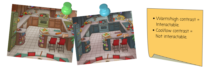
But as expected, implementing the colors came with its own trials and errors. The left figure was the initial concept we were going to use to implement the colors before it was recommended that we switch to right figure, on the right, which conveys our color intractability more clearly. However, when we attempted to implement the blue in our cabinetry, it felt cold and modern; we would later find out that this was because the fifties cabinets were made of laminate, not wood.
So, we decided to try the initial concept, which was warmer but didn’t incorporate the intractability we wanted, and the countertops were too high contrast.


After further advice from our professors and a little more research on the materials used for our cabinetry, we reverted to our original concept, but switched the blue to the Zomp green from our color palette, and swapped the wood material for a material that was closer to Formica.
These second and third passes of textures, though not the final, brought us much closer to the feeling we are trying to convey to our viewers and players: The warm sense of nostalgia that makes you want to relive your childhood.
Read More…

